
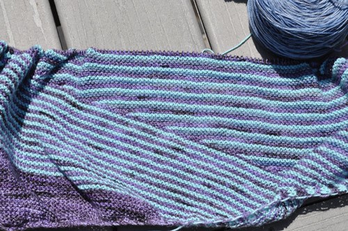
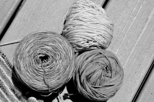
I like it, and I’m going to keep going. But I’ve definitely come to the conclusion that I should probably have thought about my yarn choices a little more. The blue and purple are both pretty much the same value, and don’t contrast as much as I’d like.
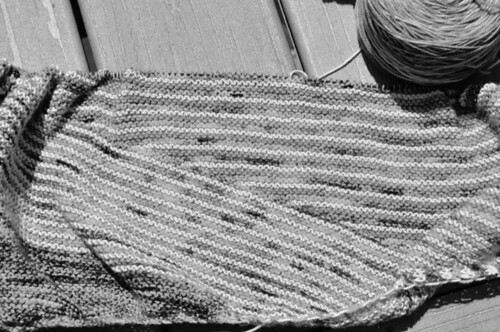
Do you see it? How about now?
And yeah, if I’d really thought about it and not been in such a hurry to pick yarn before I went to Maryland, I would have caught it.
Yeah. Don’t be like me. Take your time picking your yarns for Color Affection. THEN you can enjoy the hell out of knitting it. You’re welcome.


3 comments:
I went with light gray, purple, and a golden yellow specifically because I wanted high color contrast...like ka-POW!!! Of course, I haven't gotten to the stripy part yet, but you should have heard the 'Oooo's at knitting when I pulled out the yellow...
It is pretty, but it's amazing how the black & white photo helps clarify the value differences (or lack thereof). I am seeing so many of these shawls - it sounds like fun!
I am sorry, but I love the colors you choose. I like the play of similar values in colors. I think it is beautiful.
Post a Comment